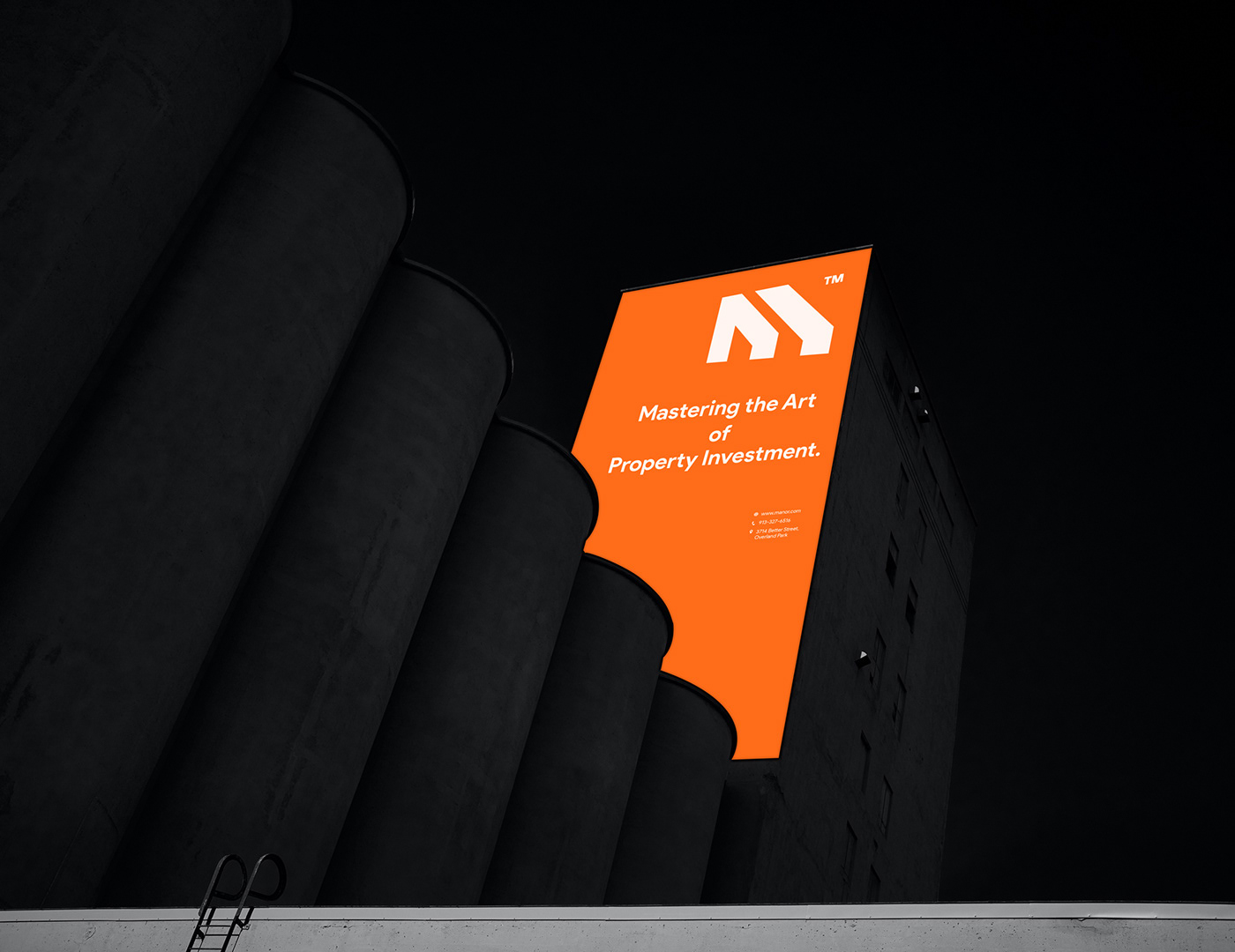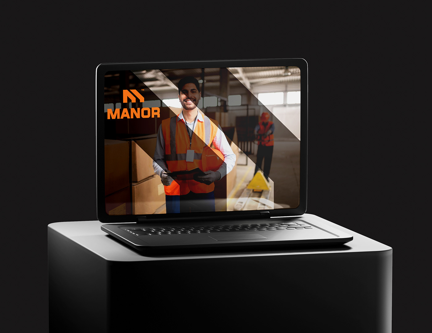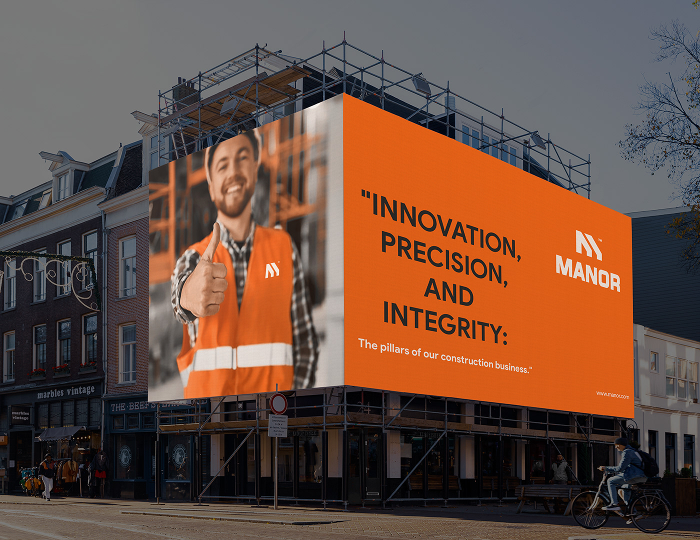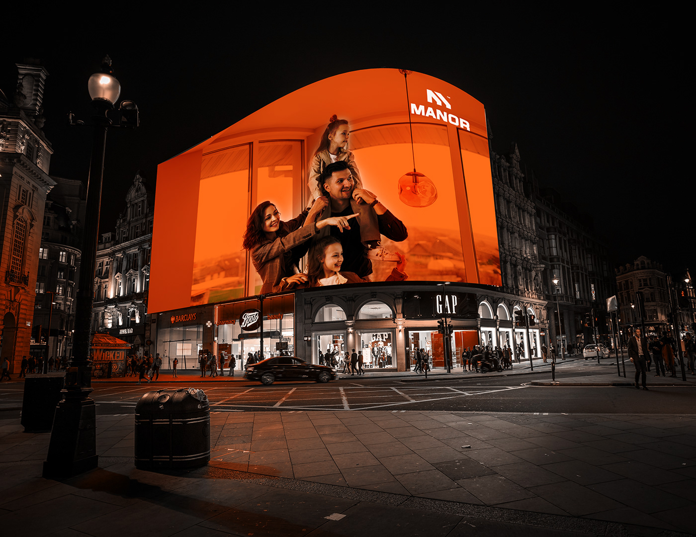
Manor Logo and Brand Identity Design
Client - Manor
Conceptualization - Mst. Eva
Hey guys 👋
Open to new projects...
Looking for a modern creative logo & brand identity design?
Reach out via Behance or direct e-mail: 📧 designburg24@gmail.com
For fast response👇
Follow Me
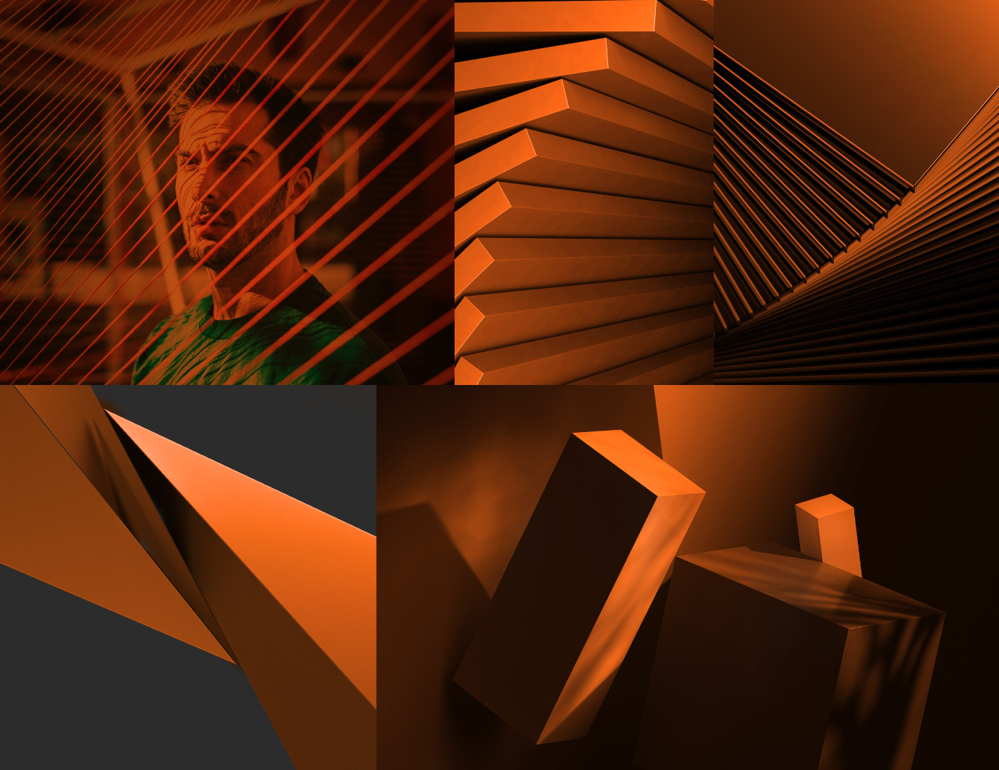
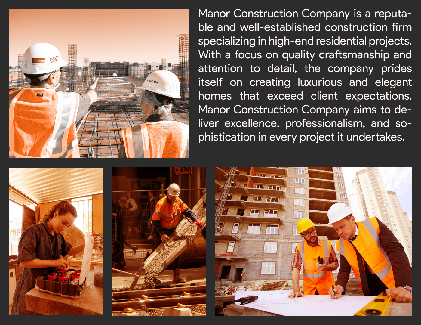
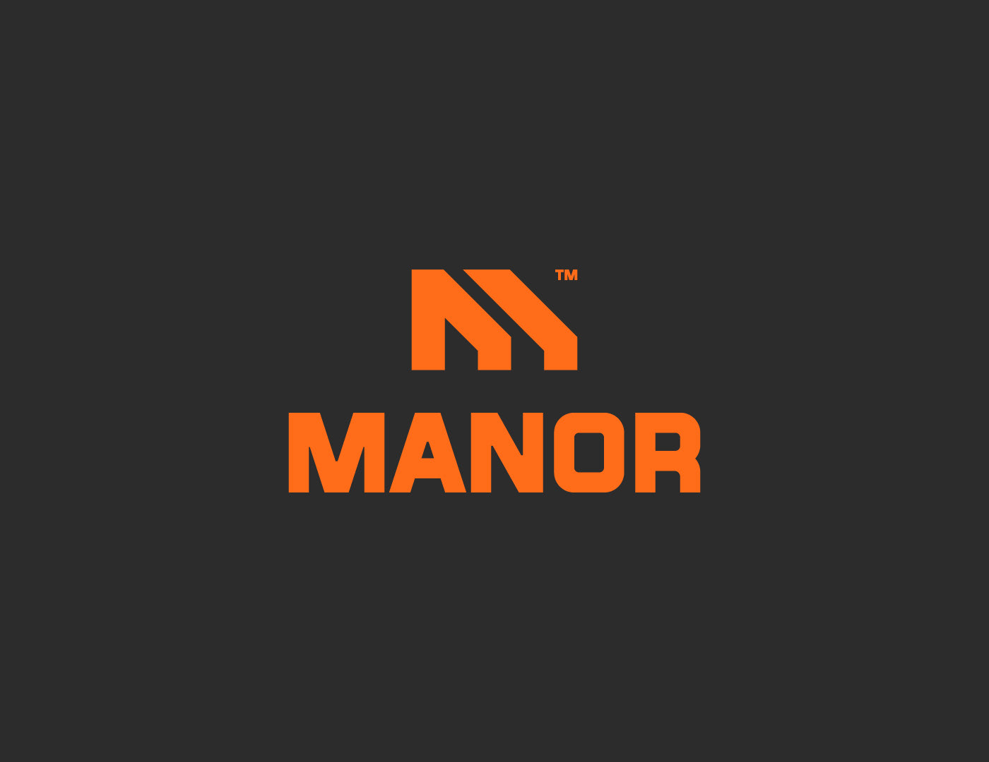
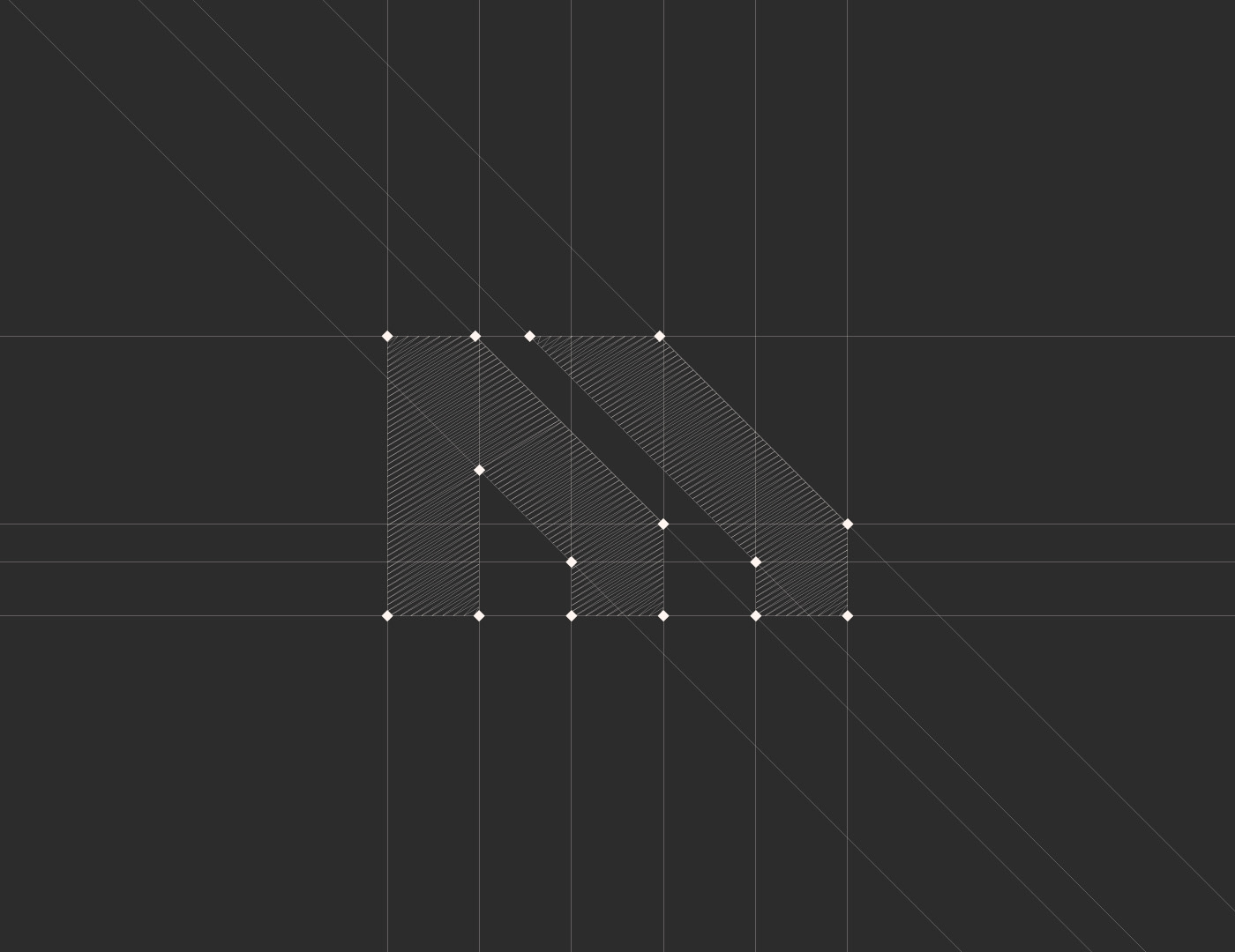
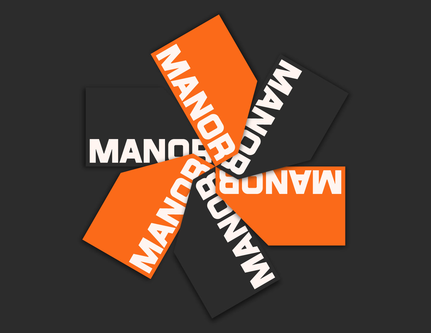
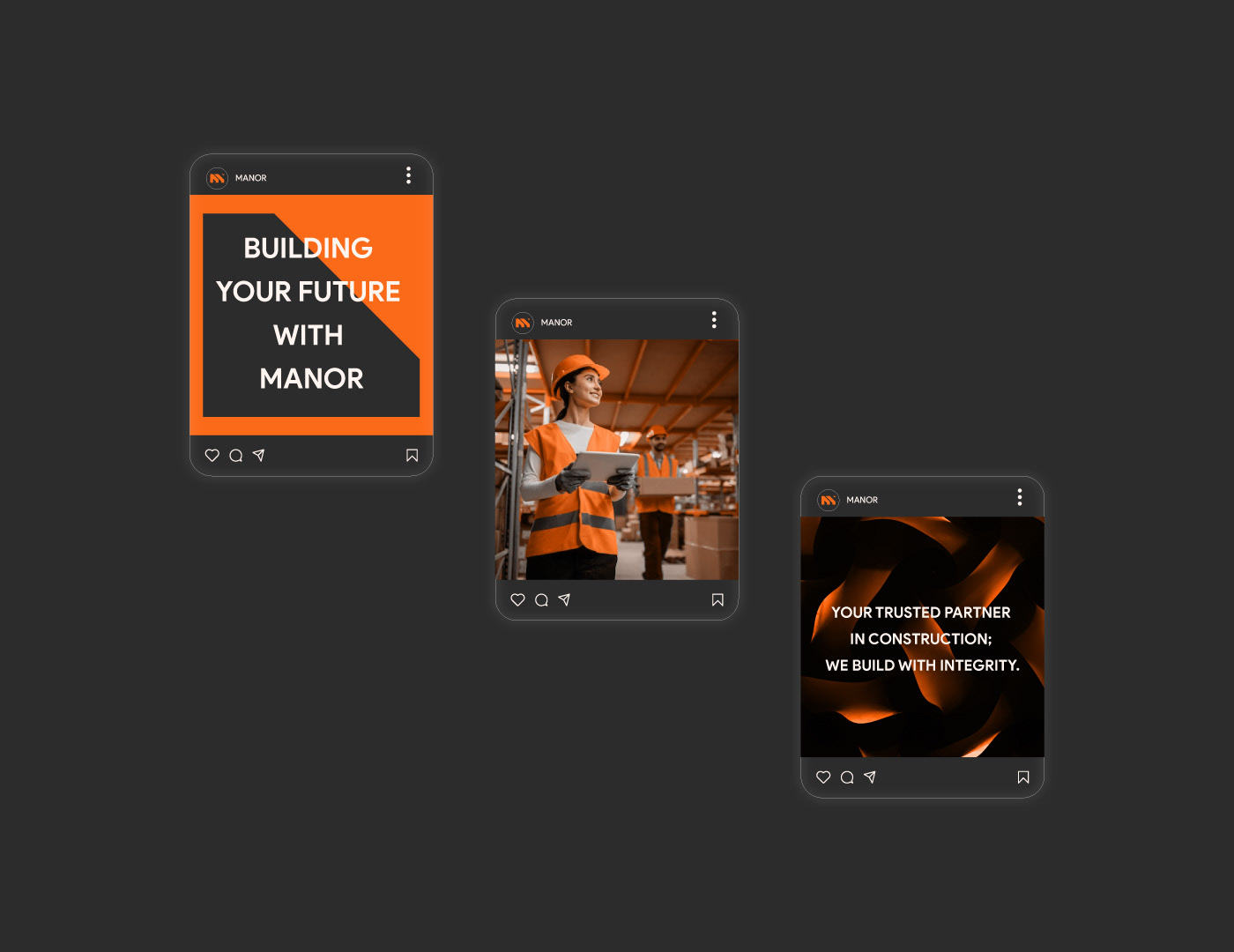
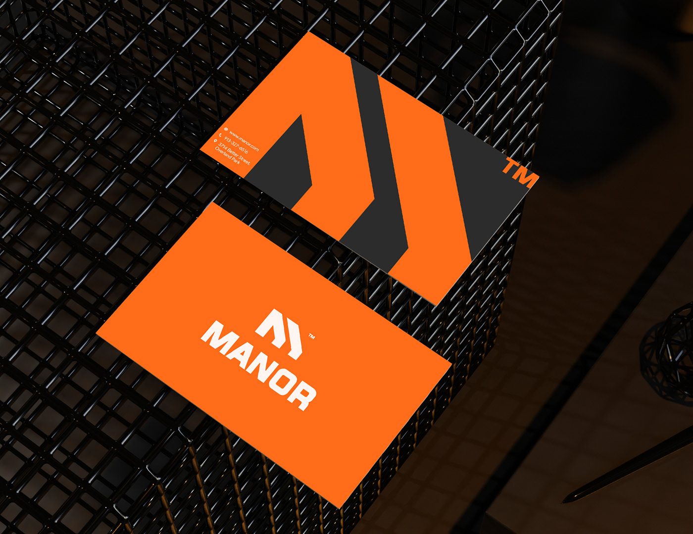
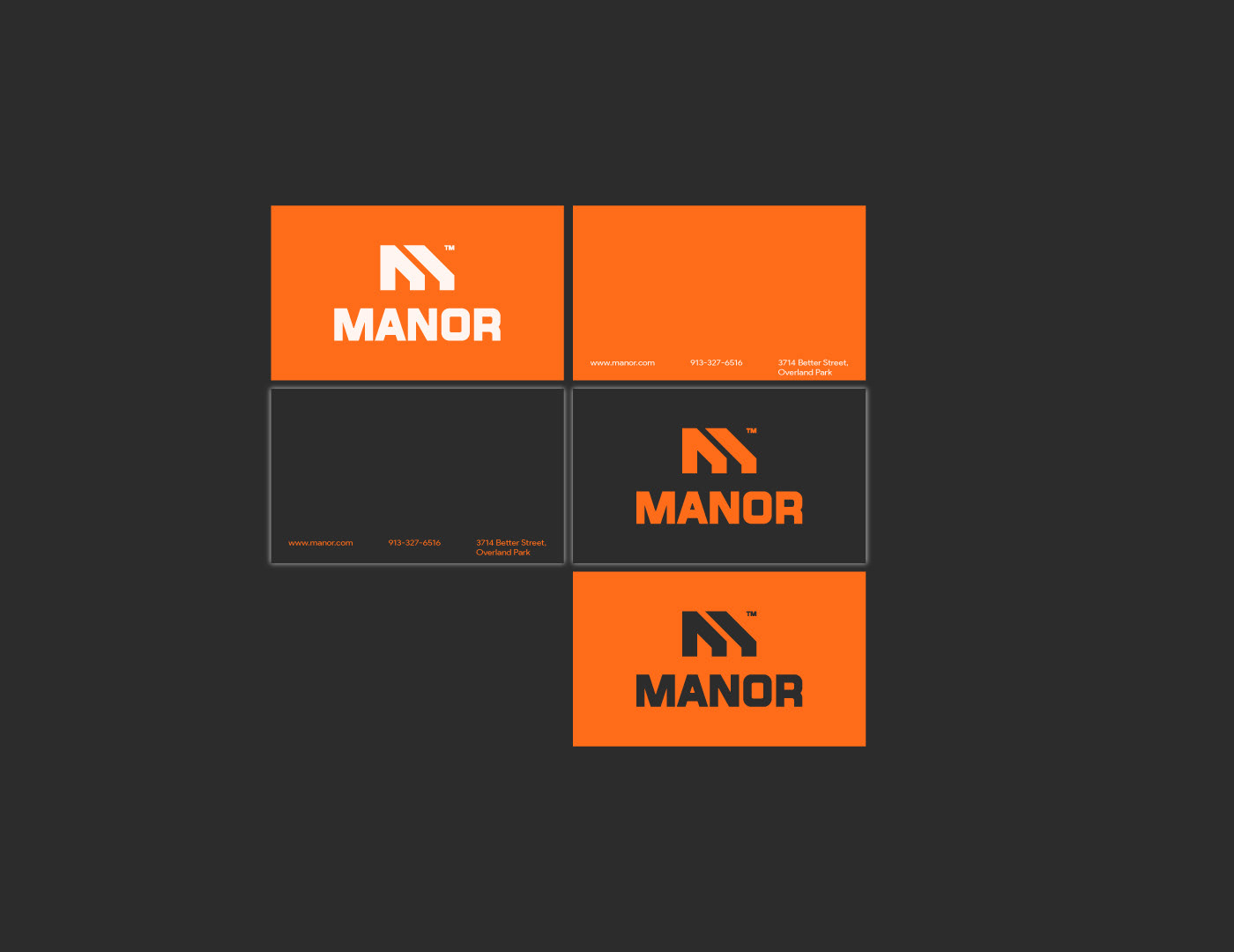
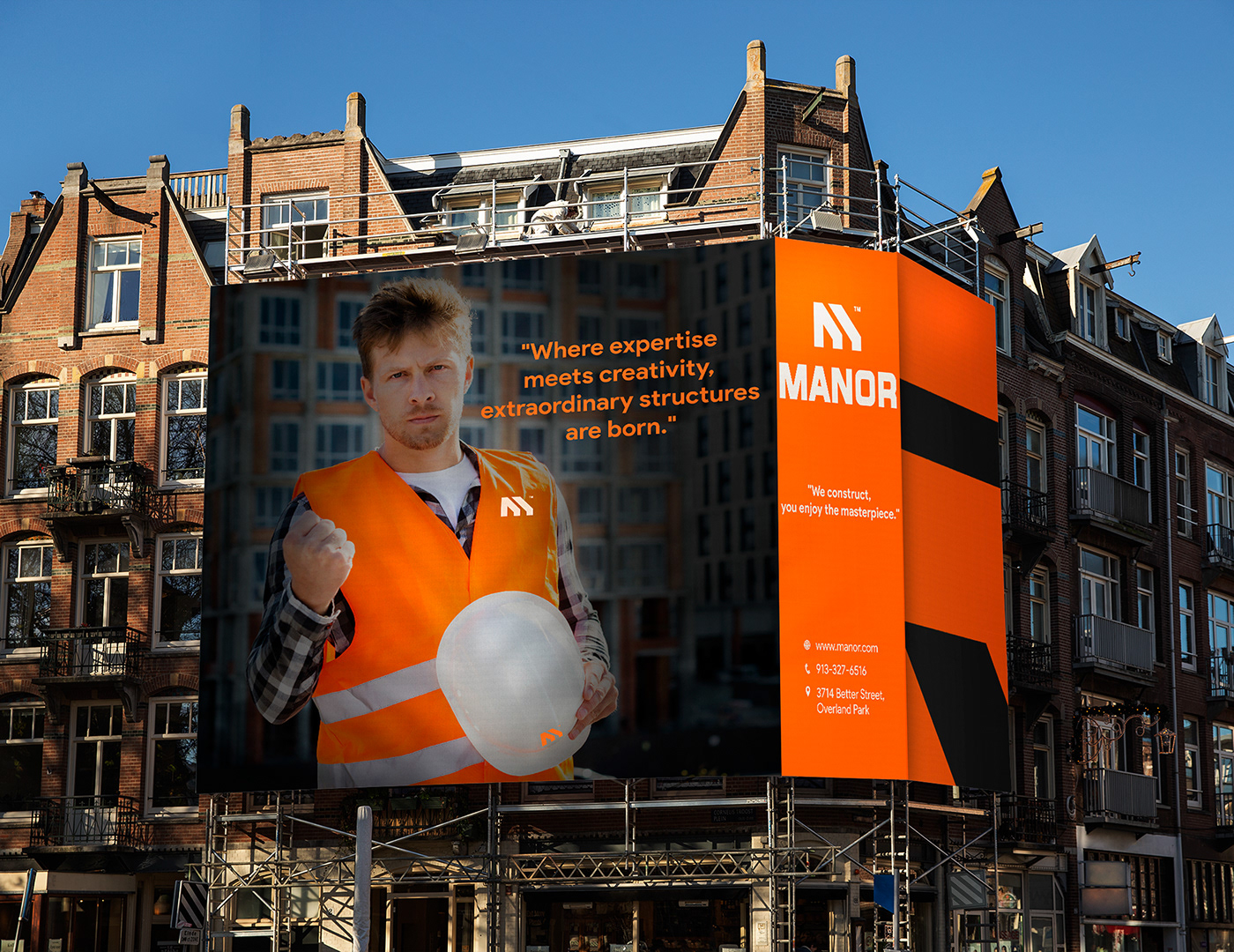
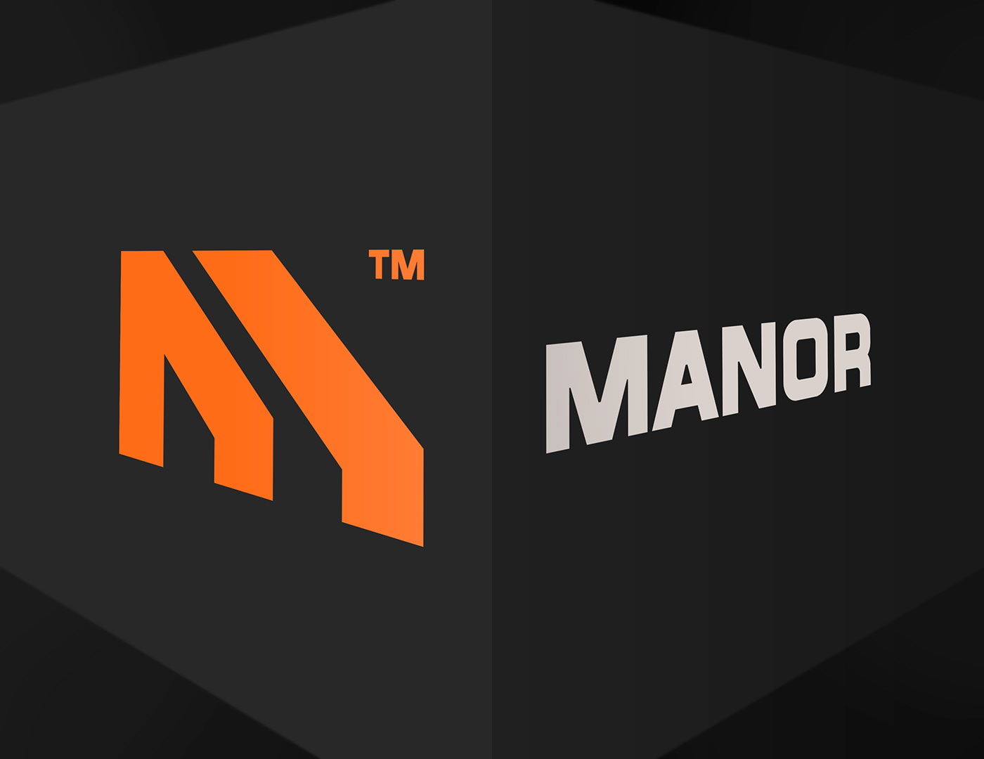
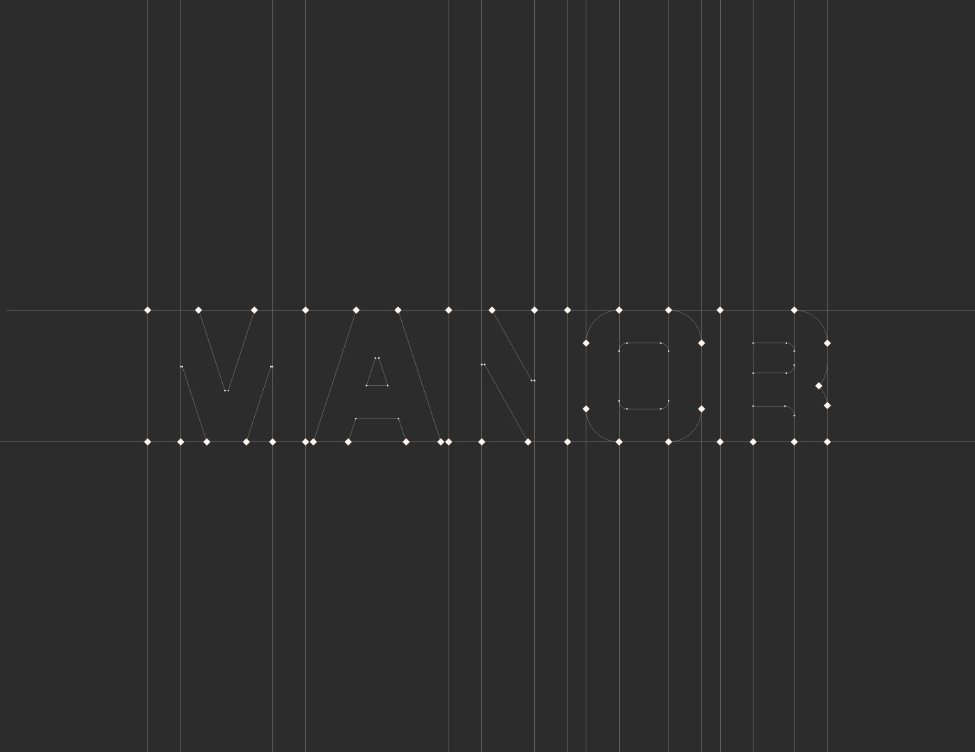
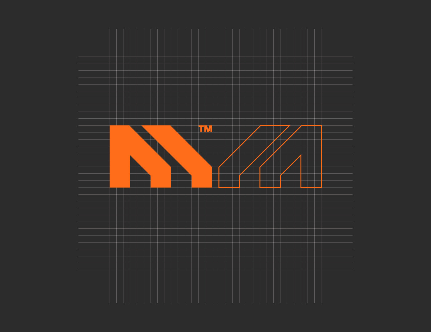
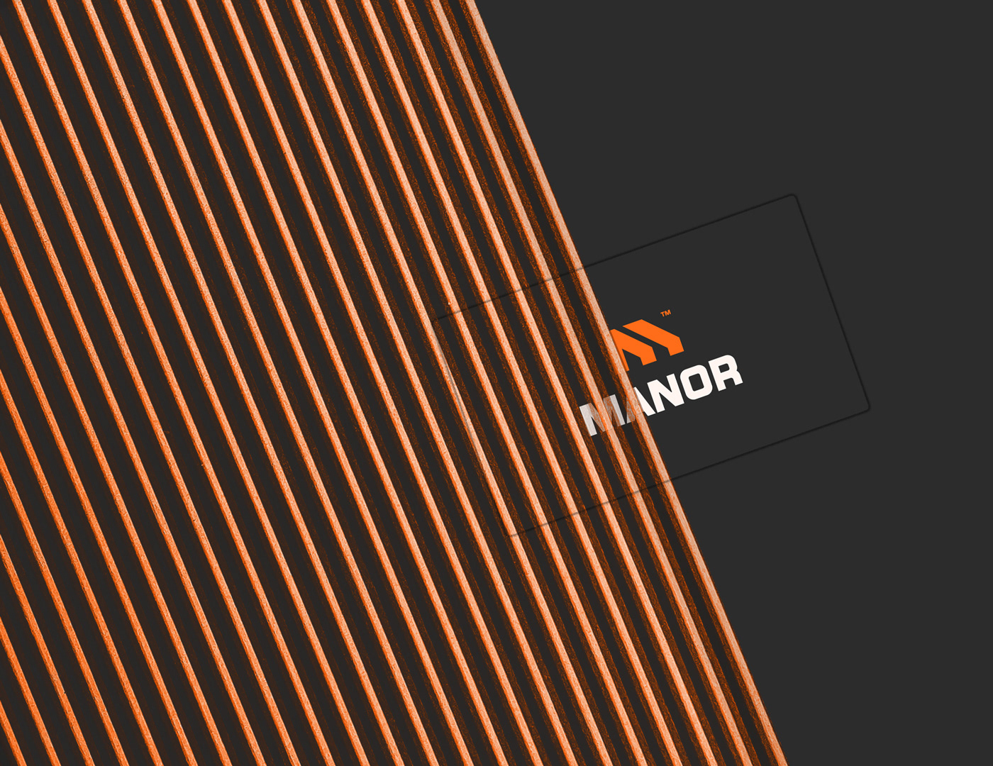
The Manor Construction Company logo features a customized letter "M" that incorporates a distinct construction aesthetic. The icon represents the company's commitment to quality craftsmanship and its expertise in the construction industry.
The letter "M" in the logo is meticulously crafted to resemble a sturdy structure, embodying strength and stability. The customized shape of the letter symbolizes the company's ability to shape and build remarkable structures that stand the test of time.
The construction feel is emphasized through the careful selection of design elements. The edges of the letter "M" are slightly beveled, giving it a three-dimensional appearance reminiscent of a solid foundation or building blocks. The lines and angles within the icon suggest precision and expertise, reflecting the company's attention to detail.
Overall, the Manor Construction Company logo with its customized letter "M" and construction-inspired design elements effectively captures the essence of the company's expertise, reliability, and dedication to delivering exceptional construction projects.
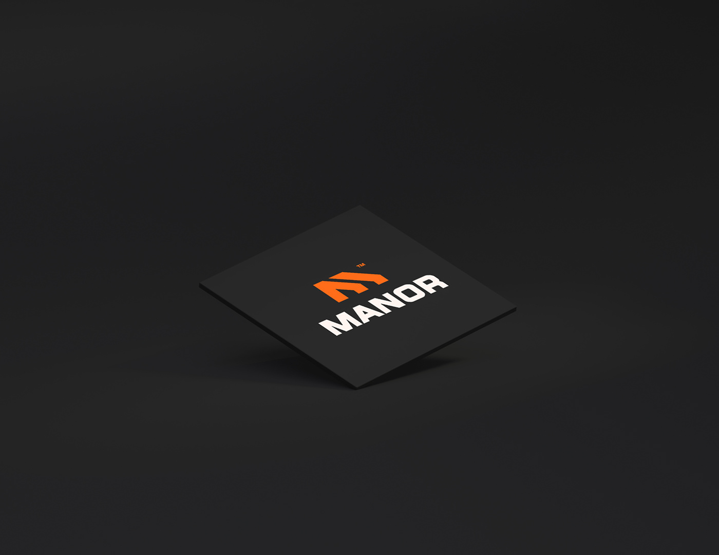
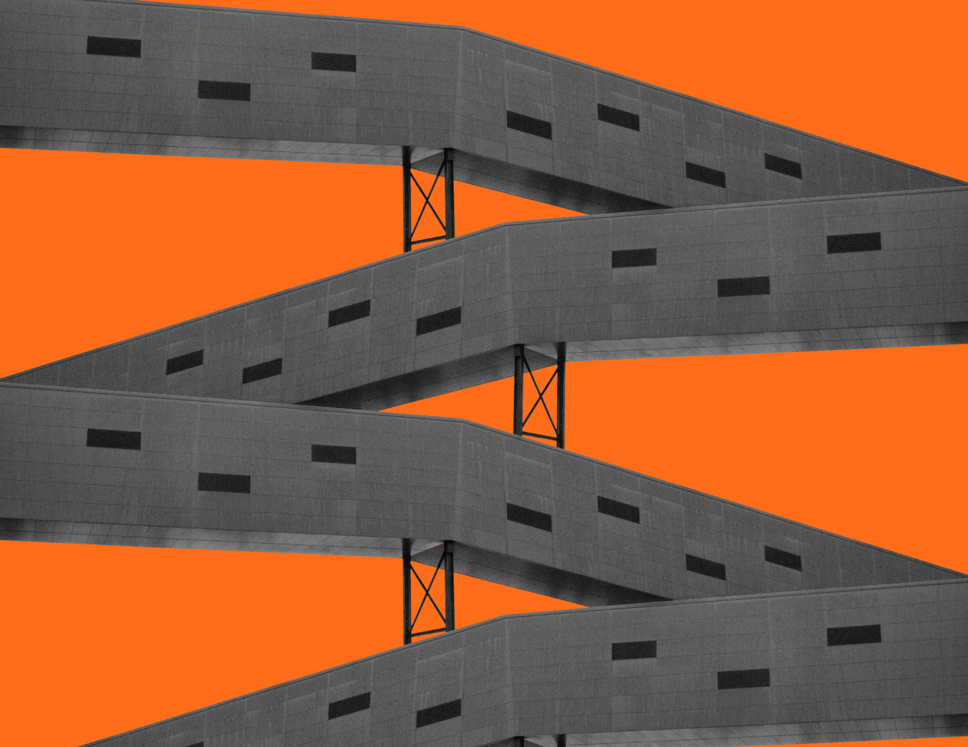

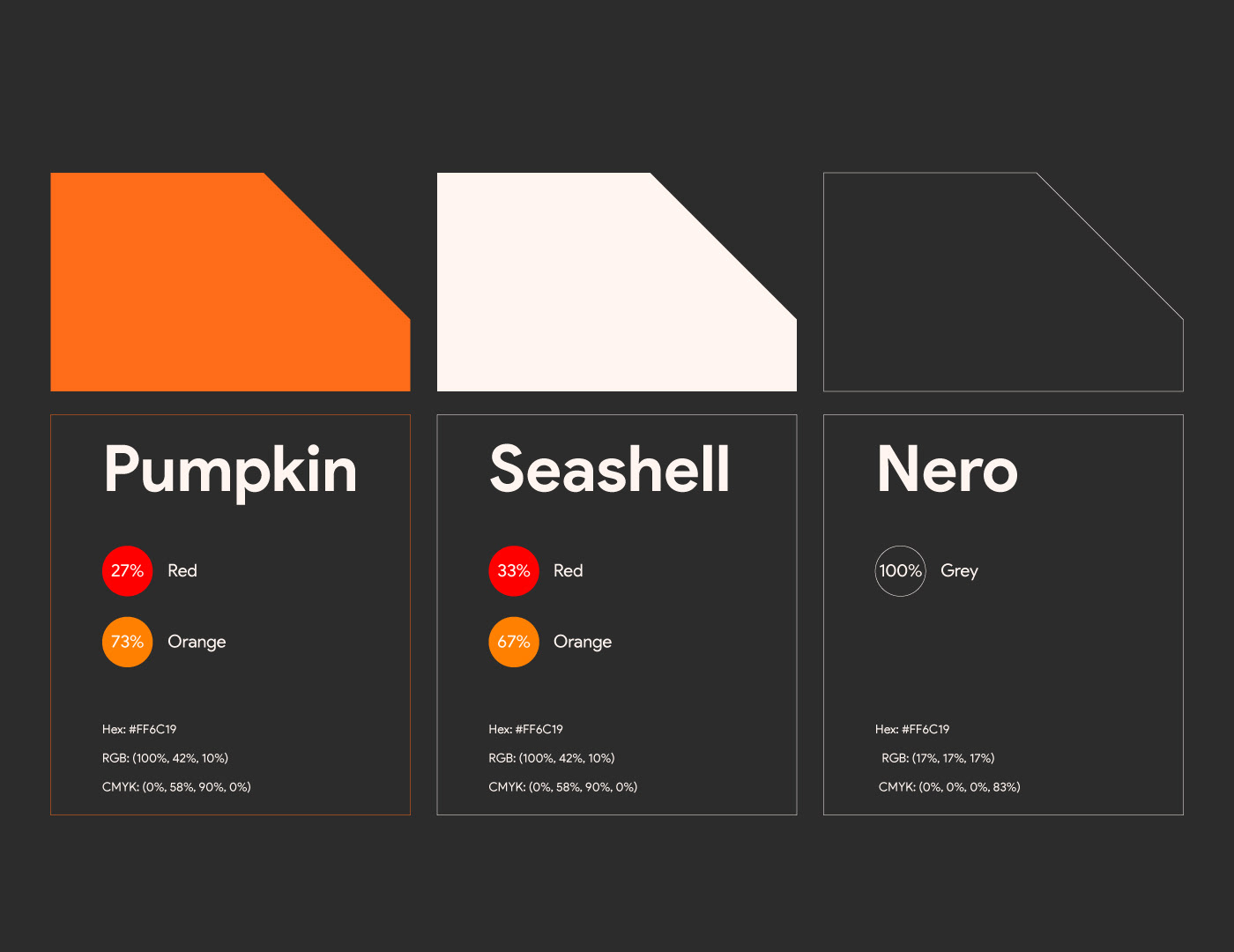
The color palette chosen for the logo further enhances its construction theme. A combination of earthy tones such as deep brown, warm gray, or charcoal black can be used to convey a sense of durability and professionalism. These colors evoke the natural materials often associated with construction, such as wood, concrete, or steel.